We’ve all seen the two extremes: the breathtaking gallery wall in a design magazine that looks like it came together effortlessly over a lifetime, and the sad grid of mismatched frames from a big-box store, hung with hope, that somehow makes a wall feel more anxious rather than artistic. The gap between them isn’t money or natural talent — it’s intention.
A gallery wall isn’t just a way to fill blank space — it’s a piece of visual storytelling, a curated snapshot of your life and taste. Done carelessly, it’s visual noise. Done thoughtfully, it becomes the emotional focal point of a room and a genuine conversation starter. Here’s how to move from haphazard hanging to real curation.
Curate, Don’t Just Decorate
Before you touch a hammer, shift your mindset: you’re not filling a wall — you’re building a collection.
- Decorating chases filler; curating chases meaning.
- Decorating worries about matching; curating aims for harmony instead.
- Decorating finishes a project; curating starts something that keeps growing.
Your gallery wall should have a clear point of view — even a simple one like “things we genuinely love.”
Three Things Every Good Gallery Wall Gets Right
Cohesion — What Ties It Together
- A shared color story: limit yourself to two or three main colors repeated across the pieces — a black-and-white photo wall or one with recurring pops of a specific color both read as cohesive.
- Frames that “talk” to each other: they don’t need to match exactly, but keep them related — all wood tones, all thin metal, or a mix unified by a consistent mat color.
- A unifying subject: all travel photography, all botanical prints, all abstract line drawings — a shared theme creates instant cohesion.
Composition — How It’s Arranged
- Start with an anchor piece — your largest or most striking item, usually placed slightly off-center.
- Aim for balance, not symmetry — a large piece on one side can be balanced by a cluster of three smaller pieces on the other. Step back and see if one side feels visually heavier.
- Keep spacing consistent — roughly 1.5 to 3 inches between frames creates the uniform “breathing room” that makes a complex layout feel intentional.
- Center the whole arrangement at eye level — roughly 57–60 inches from the floor, the standard museum height, which is genuinely comfortable to view.
Contrast — What Keeps It Interesting
Cohesion without variety gets boring fast.
- Mix sizes — large, medium, and small pieces together.
- Mix orientations — blend vertical and horizontal formats.
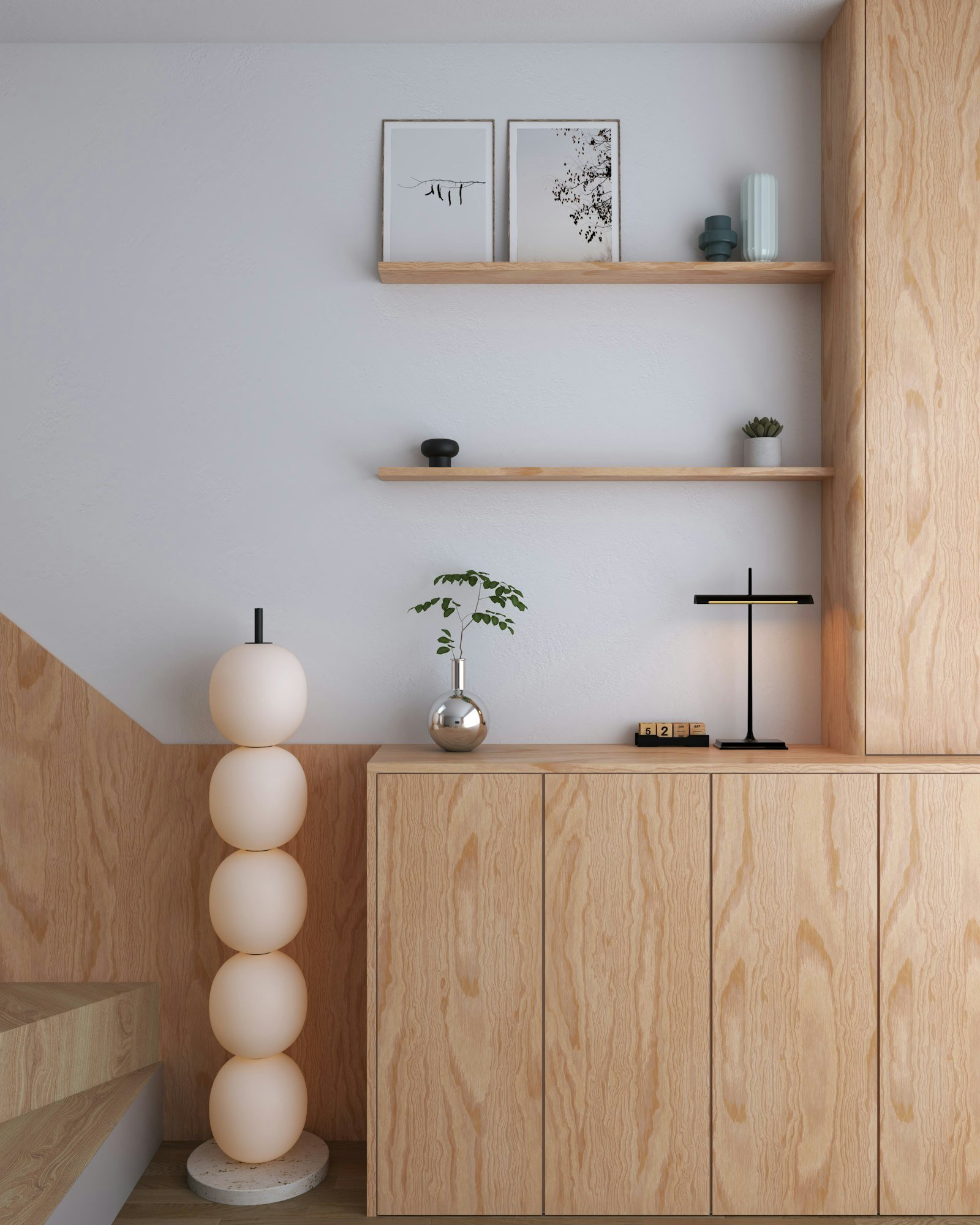
- Mix materials — a small mirror, a piece of woven textile, a floating shelf with an object on it, or a decorative plate adds real texture beyond flat prints.
- Include one “odd one out” — a piece that gently breaks your own rules, like an unexpected color or an oddly shaped frame, gives the wall personality.
A Foolproof Way to Hang It Without Regret
The biggest gallery-wall killer is guessing and hammering holes on the fly. Use paper templates instead.
- Lay everything out on the floor in front of the wall and play with the composition until it feels right — take a photo for reference.
- Trace each frame onto craft paper or newspaper, cut out the shapes, and label them.
- Tape the templates to the wall using your floor photo as a guide — live with it for a day before committing to anything.
- Mark where the hanging hardware goes on each template by holding the actual hook against the paper and marking the spot.
- Hammer through the paper mark directly.
- Tear the paper away and hang — everything lands exactly where you planned.
Sourcing With Soul
A strong gallery wall is collected over time, not bought in a single trip.
- Personal pieces: your own photography, kids’ artwork, framed wedding vows, vintage family photos, a map from a memorable trip.
- Found treasures: thrift-store paintings, old book plates, postcards, record covers, unique plates — anything with a bit of patina and mystery.
- Commissioned art: pieces from local artists, independent printmakers, or a talented friend — supports real creativity and adds something one-of-a-kind.
- A few reliable prints: affordable museum reproductions or online print shops to fill gaps and pull the whole wall together.
Let the Wall Keep Growing
A gallery wall should be allowed to evolve — leave space for the next find, the next vacation photo, the next piece of art you haven’t discovered yet.
A finished wall shouldn’t just say “I filled this space” — it should tell a story: a sketch from a close friend, a photo of a perfect moment, an odd thrift-store find that makes you smile for reasons you can’t quite explain.
Skip perfection and aim for connection instead. Start with one piece you genuinely love, then add another, building slowly. The best gallery walls aren’t in museums — they’re the ones telling the story of an actual life, hung with care in someone’s home.
Common Questions
I’m renting — how do I avoid putting a hundred holes in the wall?
Modern adhesive strips and hooks can safely hold several pounds — test one in an inconspicuous spot first. Alternatively, install one or two long floating shelves (far fewer holes to patch) and lean your art against the wall on them for a flexible, editorial look. Or skip hanging altogether and lean larger pieces securely along the floor for a relaxed feel.
How do I mix frames without it looking chaotic?
Pick one unifying trait across your frames — all black (mixing thin, thick, ornate, and simple), all wood tones (light oak, dark walnut, natural bamboo), all metal (brushed brass, polished gold, matte black), or all white mats, which is probably the single easiest unifier of all.
How many pieces should I start with?
An odd number — three, five, or seven — tends to look more dynamic. A cluster of three is a low-commitment starting point you can grow outward from over time. Better to start small and confident than force-fill a big wall with weak pieces.
How high should everything hang?
Center the whole arrangement around 57 inches from the floor — standard gallery height. In a room where people are usually seated, like a dining room, you can lower it slightly. Adjust for your own ceiling height and eye level as needed.
What’s the most common mistake people make?
Hanging pieces too high and spacing them too far apart. Art floating near the ceiling with lots of empty wall below feels disconnected, and uneven, oversized gaps between pieces look tentative. Bring the art down to eye level and cluster it with consistent, tighter spacing for real impact.